{{ p.name }}
{{ p.summary }}{{ pr.heading }}
{{ pr.text }}
{{ grp.heading }}
- ·{{ it }}


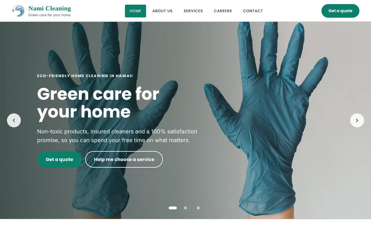
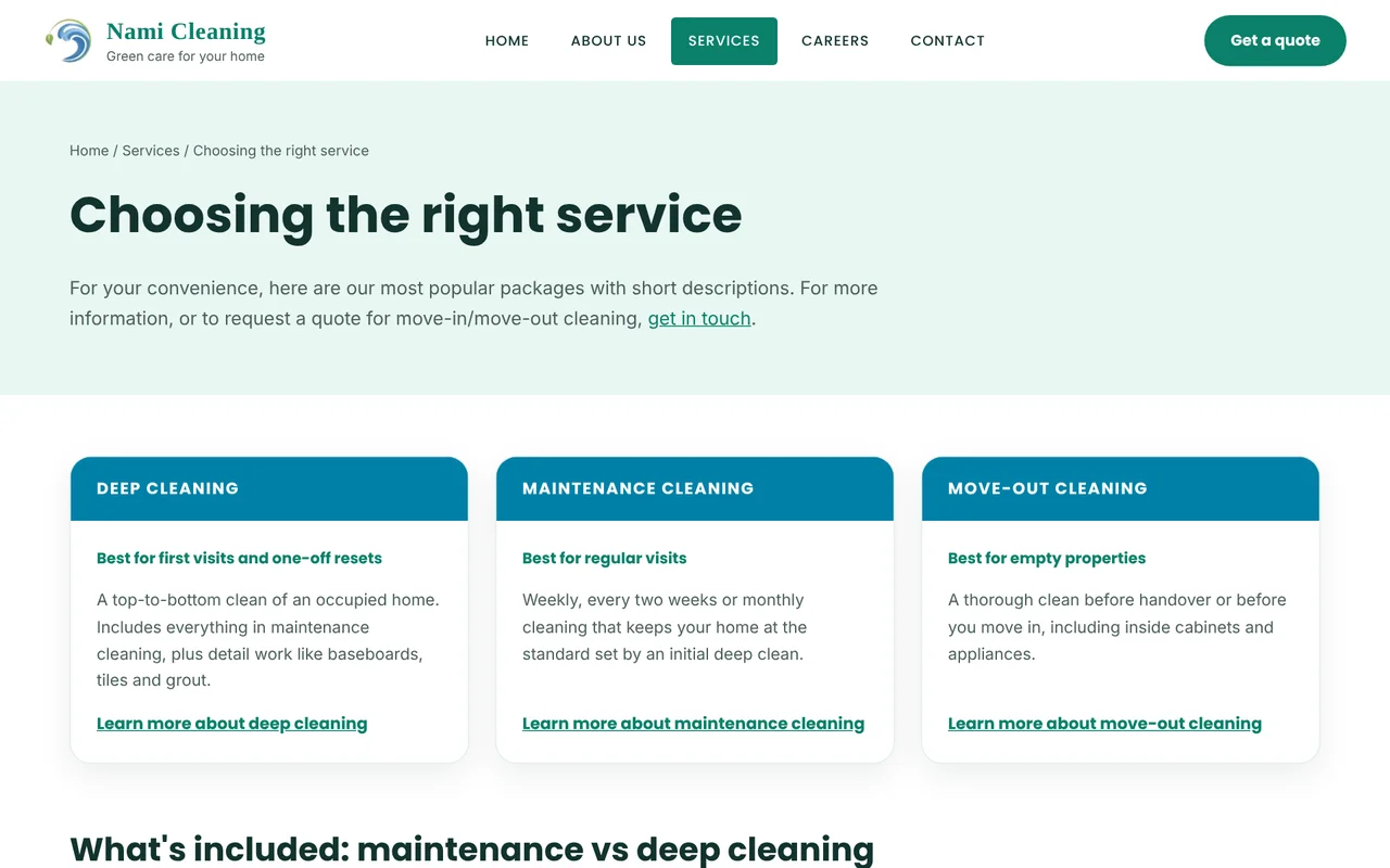
Every quote at Nami Cleaning, a Hawaii green cleaning company, took about four emails. On a small budget, I redesigned the site and quote forms so customers could answer their own questions and request a personalised quote in one go.
The content, buttons, links and the different ways users can reach a booking are all based on the user testing. Scroll inside each screen to see the whole page.
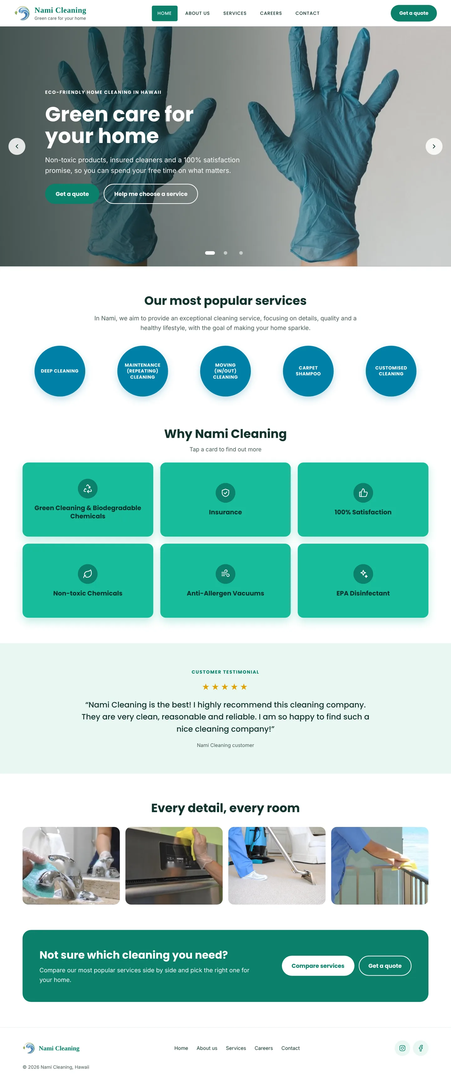
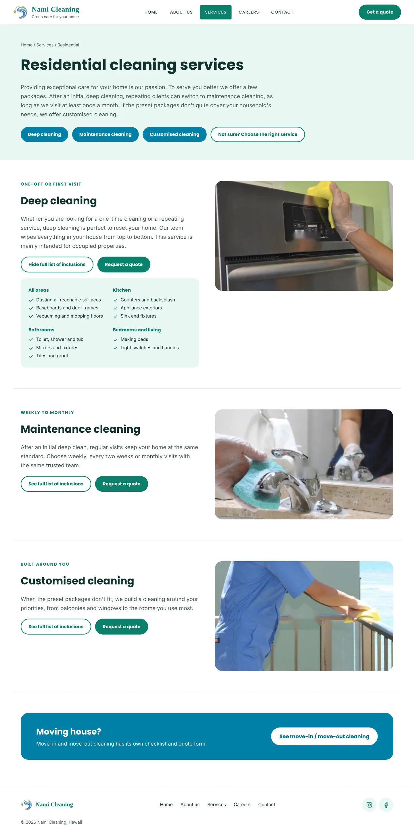
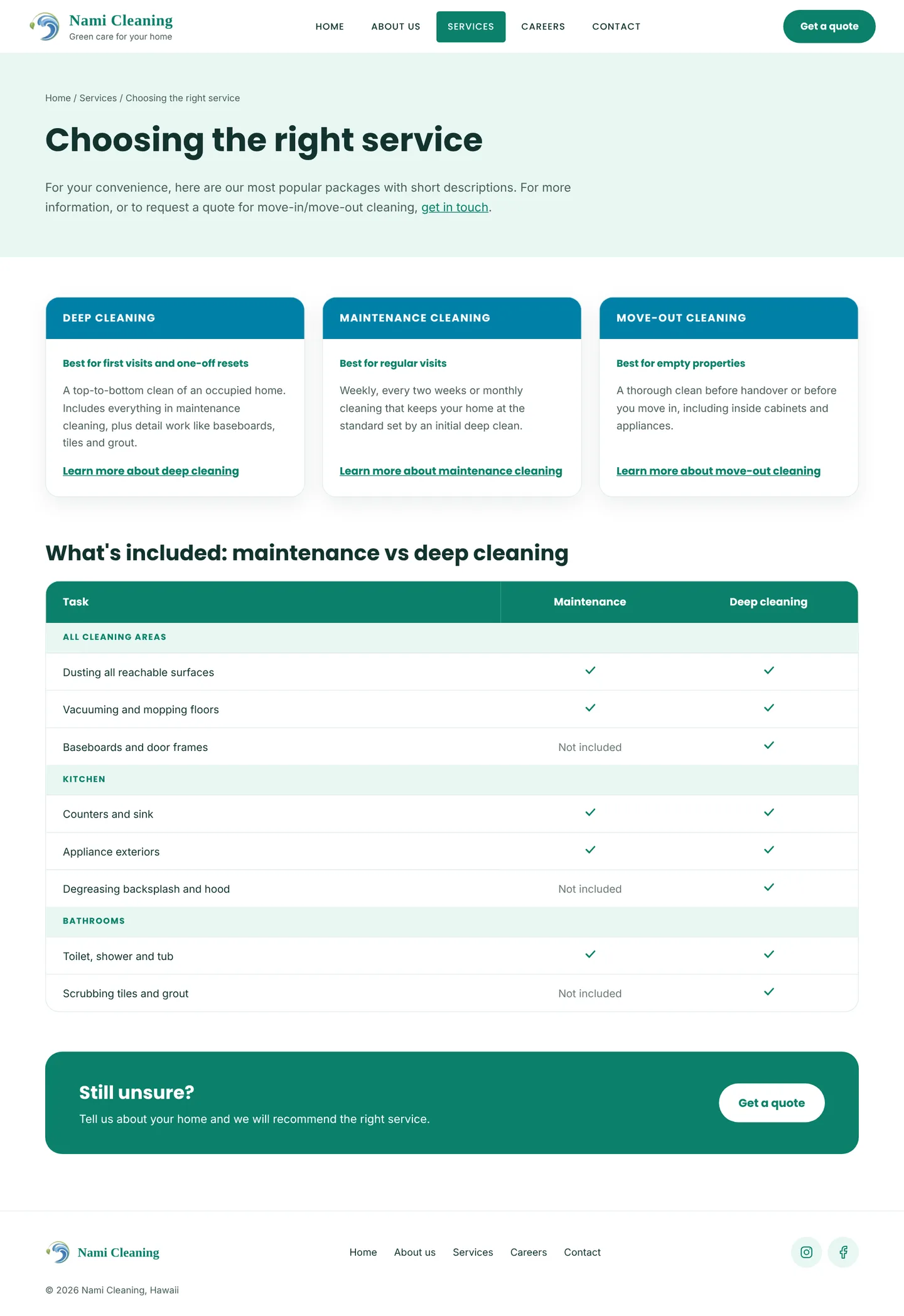
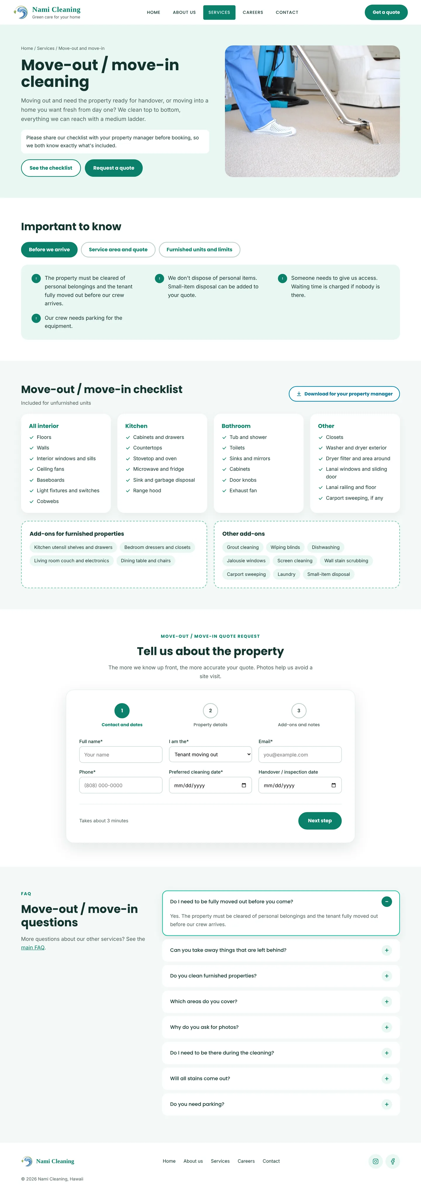
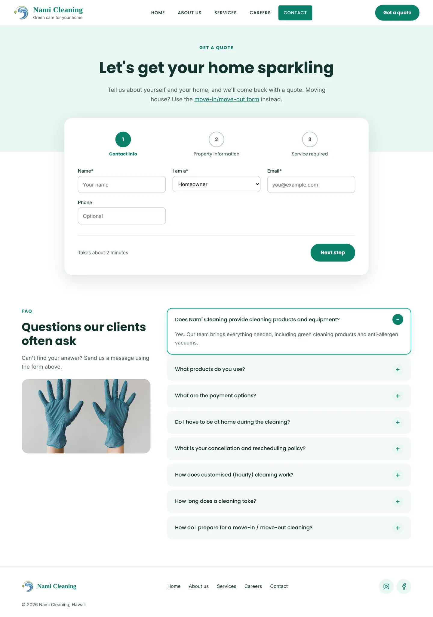
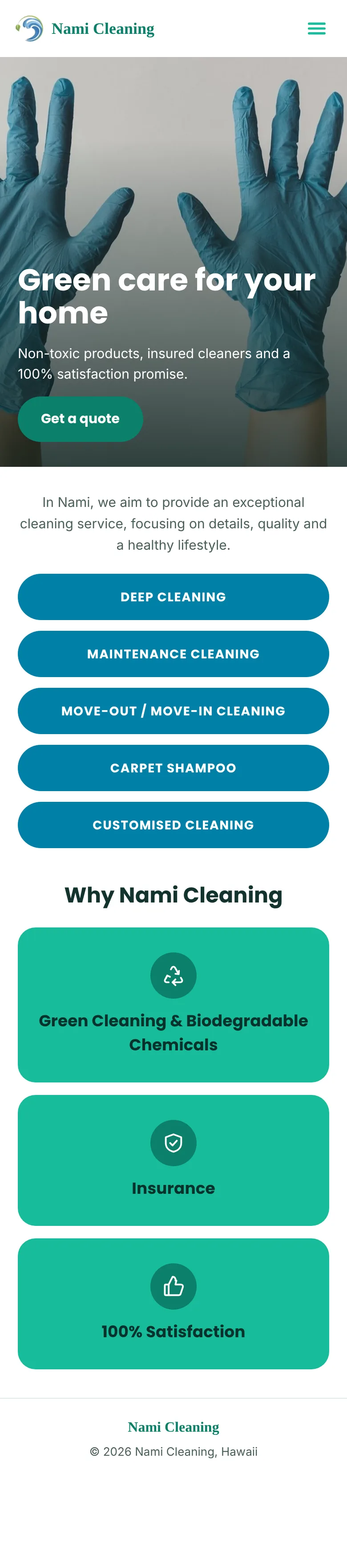
With little time and rapid prototyping, I started from a simple site map and updated it after each round of user testing. Pages still in development were planned in from the start, so the structure could grow without a redesign.
Nami Cleaning has an issue with the staffing required to answer multiple clients’ requests and emails prior to scheduling a service. Information on the website was inadequate in providing the details about the cleaning experience and requirements of certain packages, about the service area, cleaning lists, and most importantly it didn’t emphasize their competitive advantage.
The process of quoting included limited information given by customers via email or Yelp, and would be usually followed up by a series of questions by a Nami Cleaning representative to determine the price.
It would usually take at least 4 back and forward emails to provide a quote for already priced items.
Decrease the number of back and forward questions and answers via email and texts when clients are booking a service. Inform clients about all the requirements and expectations of the service before contacting Nami Cleaning.
The proposed solution included designing the app for the repeating (existing users) and redesigning the responsive website. The website needed to include:
Nami Cleaning management has decided not to proceed with ordering the design for the mobile app at this time, as they are preparing for a series of operation changes.
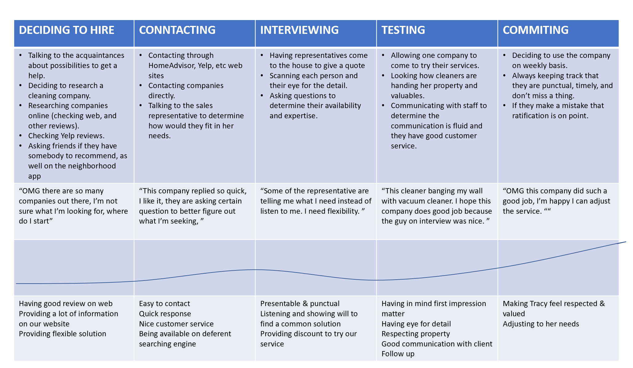
Based on the target market and analysis of existing customers, I developed the personas and a user journey.
{{ pr.text }}
New website and its effects on operational improvements & survey analysis.
After the launching of the new website, the company agreed to survey existing customers, under the condition to include questions about business in general with a few questions about the website. 10 clients, B2B and B2C, responded.
It’s important to mention that some of the tested customers value the personal touch of the company (or are in the age group that does not use the internet as much) and have never visited the website.