3W
Weather, Wave, and Water
In this case study, I will present the 3W (Weather, Wind, Water) App, the main project for my UX Design Course at CareerFoundry. I will lead you through the main steps of the process and try to explain the reasoning behind the decisions I made along the way.
Intro
MY ROLE
UX Designer, UX Researcher, UX Strategist, Information Architect, UX Writer
METHODS
Competitive Analysis, User Interviews, Card Sorting, Preference Testing, Affinity Mapping, Usability Testing, Wireframing, Prototyping, Information Architect
TOOLS
Whiteboard, Adobe XD, Usability Hub, Skype, Zoom,
Google Drive
UNDERSTAND
The idea of this app started with the intention to provide easy access to information about conditions in the water to surfers, kitesurfers, fishers, divers, and other watersport enthusiasts. After doing a little research, I realized that they need more than just a weather forecast, so the goal switched to designing a multi-feature app with additional information. I realized that people living by the water often enjoy more than one water activity, depending on the conditions, and that the watersport community plays a big role in their lifestyle.
MISSION
To become a one-stop shop for the needs of a water sports enthusiast by providing valuable information about the wave, wind, water forecast, and much more.
COMPETITION
There is a high number of similar apps, serving either a specific area or globally. I wasn’t able to locate an app that has all the components that I believe an active user would require. In the competitor analysis, I analyzed Surfline and Windy apps.
Surfline, while focusing mostly on surfing, is a definite leader in forecasting. Windy is targeting communication within the local community. Both apps have great features that could be combined into one app.
TARGET AUDIENCE
Our target audience is mobile users who enjoy water activities. Heavy users will be active surfers, windsurfers, kite surfers, divers, etc. That includes people who either often travel to enjoy water activities or who live in the place where the climate allows them to be on the water regularly (or the one brave enough to enter the freezing water in the winter times).
RISK/OPPORTUNITY
The risk lies in a massive competition of apps that people are already used to using. There are also high expenses for app maintenance. They are not limited but include taking care of the forecasting equipment or/and paying vendors for streaming and data (depending on which path we will choose to cover that). Most of the places need to have a local associate to help with the overview of the competitions.
The opportunity is that most of the existing apps are not covering all the needs of users that like more than one water activity. A lot of apps are focused solely on one sport or miss a better organization within the app.
COMPETITIVE ANALYSIS
CONCLUSION:
Both apps have great features
Not all that I found necessary for 3W target users
Some of the data might be too complicated for novice users
Some areas are too cluttered, and the learning curve might be longer
OBSERVE
To get an idea about the habits of 3W potential users, I dived into the user research in a form of surveys and user interviews. All of the participants of the one-on-one interview have used one or more similar mobile apps. They all have different backgrounds, but they all have in common one thing - their dedication to water activities for more than 10 years. With their avid experience in surfing, kitesurfing, fishing, spearfishing, scuba diving, bodyboarding, and sailing I was able to get an insight into the multiple needs of watersport aficionados. I used affinity mapping to organize the findings.
USER SURVEY FINDINGS
Most of the users practice more than one watersport
Most of the users use some sort of app or webcam service to determine where to go, and they are interested in streaming, weather report, water temperature, swell, currents, tide, UV exposure, and wind data
The majority of the users do not like to give advice and post online but enjoy reading other users’ advice.
USER INTERVIEW FINDINGS
All users use some app to justify the decision to go to the beach, but often the decision is made emotionally or based on previous experience
Most of the participants enjoy having some company when enjoying a watersport
Most of the participants enjoy reading/looking at advice and other people's experiences but are not so keen to post themselves
I discovered that besides data, users highly rely on the personal experience or locals
Most of the participants use Surfline webcam
Participants are spiritually connected to surfing specifically
Two out of three participants are interested in trying other watersports
Two out of three participants were proficient in more than one watersport
POV - POINT OF VIEW
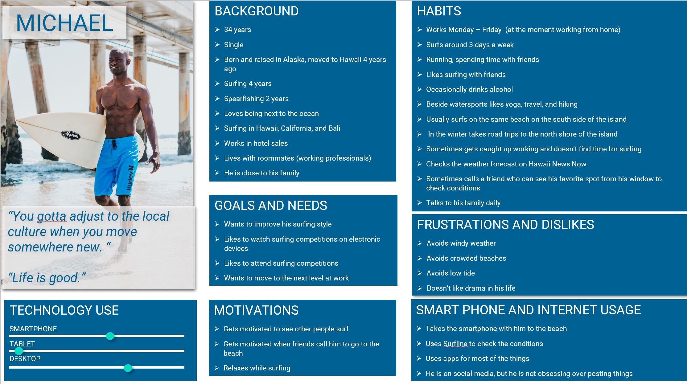
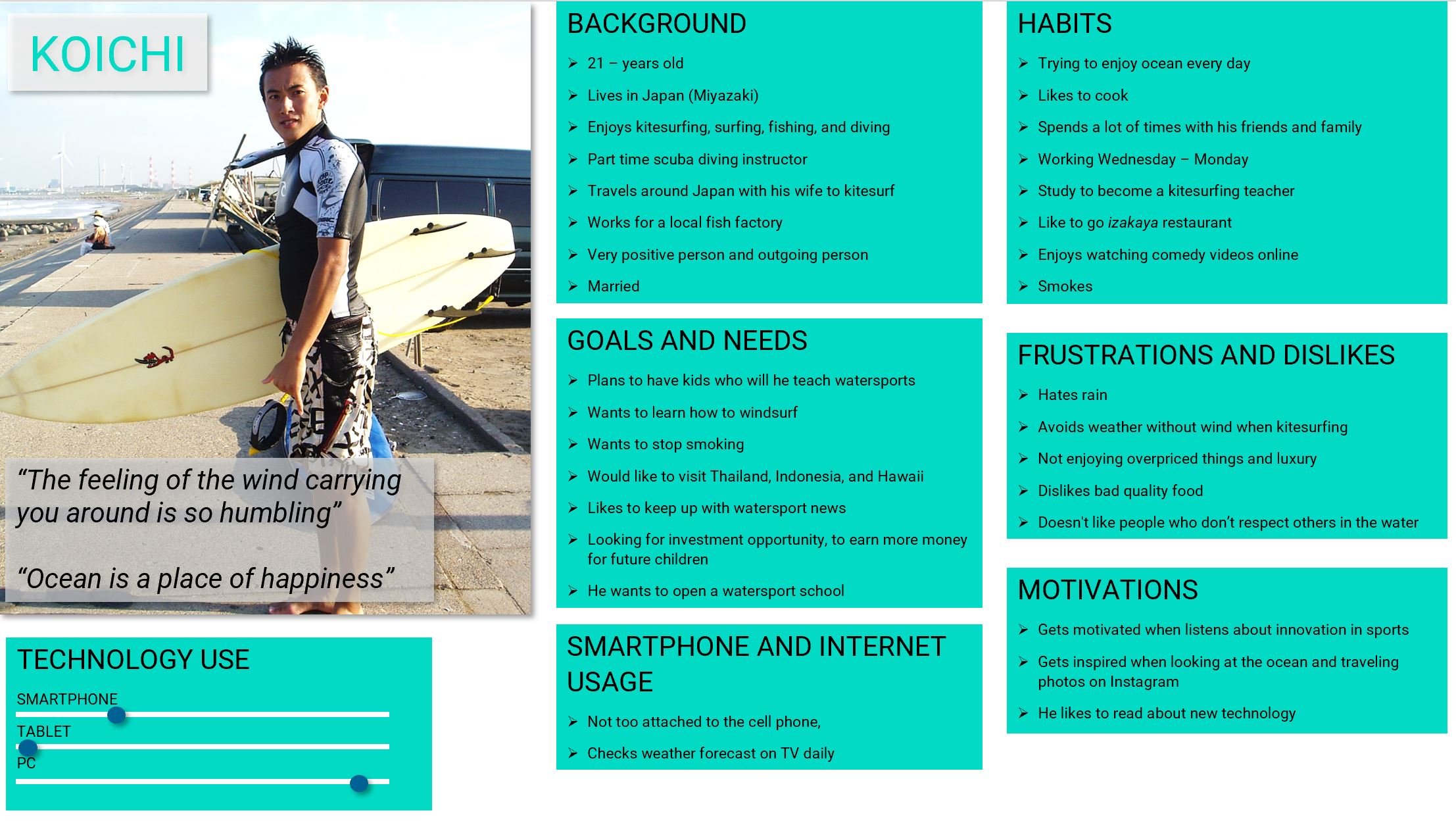
All the research data helped to create user personas and user journeys.
USER PERSONAS
USER JOURNEY MAPS
IDEATE
Focusing on user personas I developed user flows, gather what core features should the app have and develop and who would find it useful, and stepped in the information architecture by creating a site map. But before finalizing the last step, I conducted a card sorting test with potential users.
USER FLOWS
SITE MAP BEFORE CARD SORTING
CARD SORTING - BEST MERGE METHOD
FINAL SITE MAP
PROTOTYING / TESTING/
ITERATION
User research thought me that even though users consciously primarily search for the weather information, there is other information that could improve their experience in the water. Community is a big part of that, as most of the users like to go to the beach with a friend or socialize with people with the same interests (in person or online) when traveling they also like to interact with locals especially when they need to find out more about the spot, and many users are working on improving their style or skills, and they are able to do it with 3W with help of professionals.
DESIGN
The main color palette is motivated by a sun setting over the ocean colors.
TYPOGRAPHY
COPY LANGUAGE
Language is relaxed and easy as the app is intended for a wide audience, using a lot of beachside slang often used in the surfing community (Shaka, stoked, etc). In a formal text such as an explanation of paid service, or how the app issuing is used, the language is more serious, yet relaxed and approachable. The use of surfing slang and other activity-related expressions should be linked with an explanation in the desktop version.
MAIN SCREENS - HOME, SPOT 1, SPOT 2, TRAINING 1, TRAINING 2, MAP, PROFILE 1, PROFILE 2
USABILITY TESTING RESULTS - RAINBOW ANALYSIS
A usability study was conducted in person and over Zoom/Skype on 6 users aged 26 - 42 years, 3 countries, different experience levels, different marriage statuses, different occupations, different genders:
OBSERVATION
Five out of six users managed to fulfill the task successfully
One user thought he wouldn’t use the training part
Four out of six users liked that the app allows sharing forecasts outside of the app and inviting people inside
Most users felt anxious to opt into the paid version and felt there should be more info about benefits
More forecast data throughout the days is required
The forecast grading system does not indicate on which activity is referred to
Some users have gotten used to map view to see what the good spots are so this would be beneficial
MENTOR/PEER FEEDBACK
Center all the buttons
Increase white space
Increase touch space
Not sure what the number next to the training is - needs more clarity
POSITIVE COMMENTS
“The app is so useful, I would use it”
“The training part is so useful, I think people who are really into it would totally use it”
“The app is easy to navigate, there is not too much going on”
CHANGES TO MEET ACCESSIBILITY STANDARDS
Changed colors to meet AAA standards (menu, icons, forecast) - I introduced a new color - keeping a motif ocean sunset
Added visuals to complement the color indications next to icons
Adjusted the touch space
Redesign the spot screen to reduce the clutter
ONBOARDING
USABILITY TESTING RESULTS
A usability study was conducted in person and over Zoom/Skype on 6 users aged 26 - 42 years, 3 countries, different experience levels, different marriage statuses, different occupations, different genders
OBSERVATIONS
Splash screen needs more visuals that represent what the app is about
Most of the users asked what the name 3W means
The progressive onboarding screen is unrecognizable
MENTOR/PEER FEEDBACK
Remove text from the selection box to outside to improve visibility
CHANGES TO MEET ACCESSIBILITY STANDARDS
Color adjustment to meet AAA standards
Adding labels and placeholders to the forms & adjusting the color of the typing area
Increasing white space when screens have a higher amount of content
Increasing touch space
Increasing CTA font
MENTOR/PEER FEEDBACK
Removing the bubbles in click-through onboarding and adding a darker layer
Removing bubbles in progressive onboarding
Stretch the form fields (involves changing girds altogether)
PRESENT
Below is a presentation of the prototype. I will go through the ask the local flow, which includes the upgrade experience, and shortly explain the main menu and features.


